
Showing posts with label art for everyone. Show all posts
Showing posts with label art for everyone. Show all posts
Friday, July 12, 2013
Fred Smith's Concrete Park Workshop
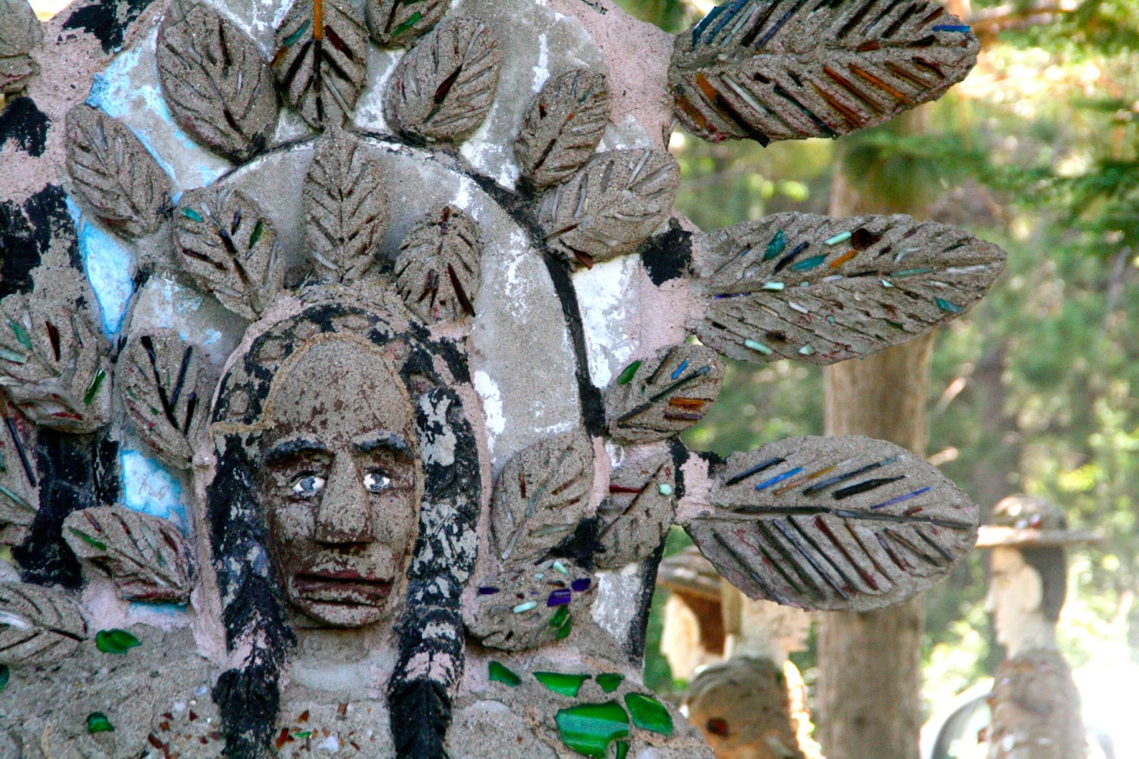
One thing that makes the John Michael Kohler Arts Center such a great place to work with is that they are constantly providing programming that not only serves the community but connects the people in the community with the art they conserve. As an intern on the exhibitions team, I had the opportunity to help out with a workshop at Fred Smith's Concrete Park in Phillips, Wisconsin. It was absolutely amazing and I think it was a massively successful workshop!


Saturday, July 6, 2013
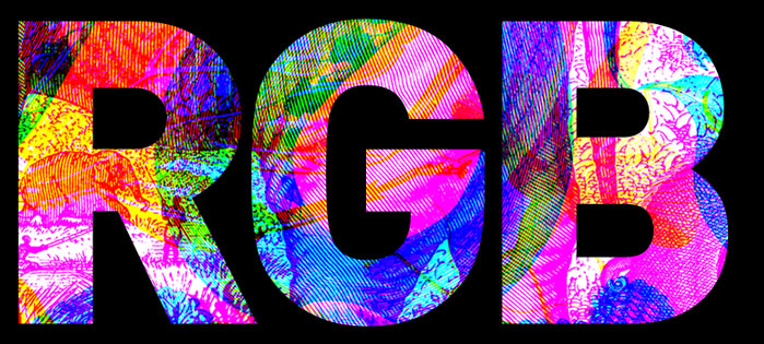
RGB
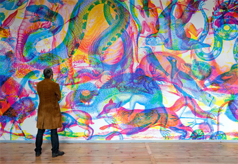
Hi Everyone! I'm back from Mexico and full of inspiration for how I'm going to make Tracing Perspectives better. Before I start the re-haul, I want to feature an installation called RGB by a design group called Carnovsky which is made up of two Francesco Rugi and Silvia Quintanilla- an artist/designer duo based in Milan.


From their website:
RGB
Color est e pluribus unus
RGB is a work about the exploration of the “surface’s deepness”.
RGB designs create surfaces that mutate and interact with different chromatic stimulus.
Carnovsky's RGB is an ongoing project that experiments with the interaction between printed and light colours. The resulting images are unexpected and disorienting. The colors mix up, the lines and shapes entwine becoming oneiric and not completely clear. Through a colored filter (a light or a transparent material) it is possible to see clearly the layers in which the image is composed. The filter's colors are red, green and blue, each one of them serves to reveal one of the three layers.
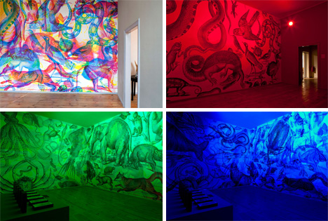
RGB’s technique consists in the overlapping of three different images, each one in a primary color. The resulting images from this three level’s superimposition are unexpected and disorienting. The colors mix up, the lines and shapes entwine becoming oneiric and not completely clear. Through a colored filter (a light or a transparent material) it is possible to see clearly the layers in which the image is composed. The filter’s colors are red, green and blue, each one of them serves to reveal one of the three levels.
Don't you want to just stand in there and soak it all in?
I also really love that they went with the encyclopedic drawings.
Here are some more pictures:
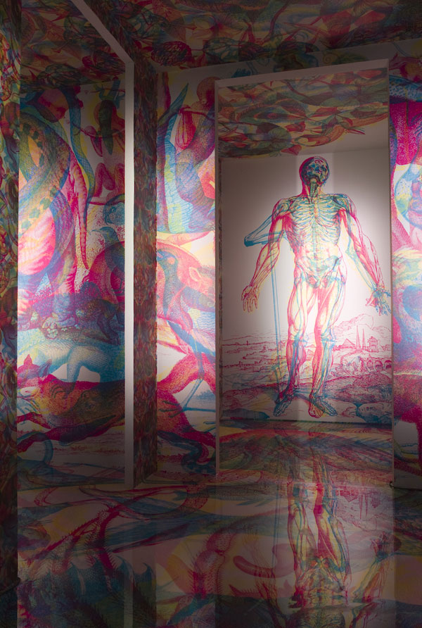
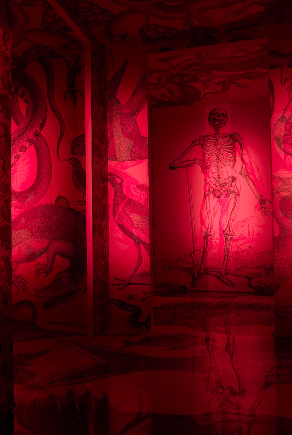
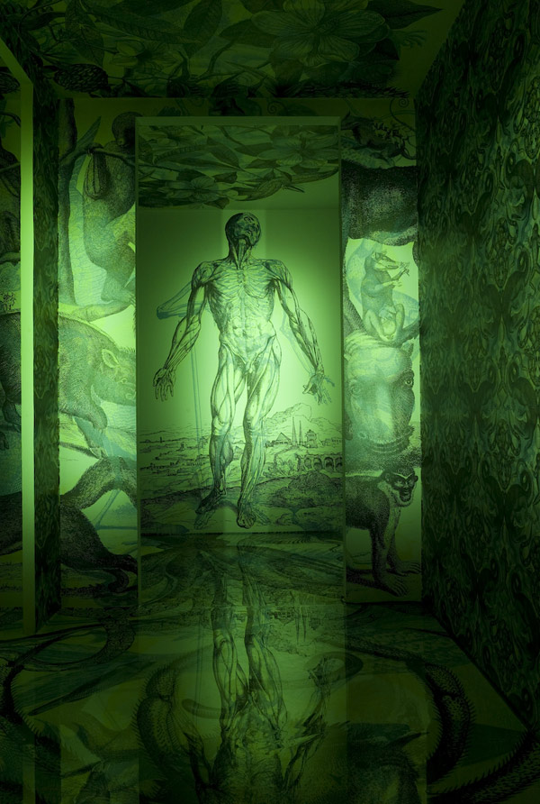
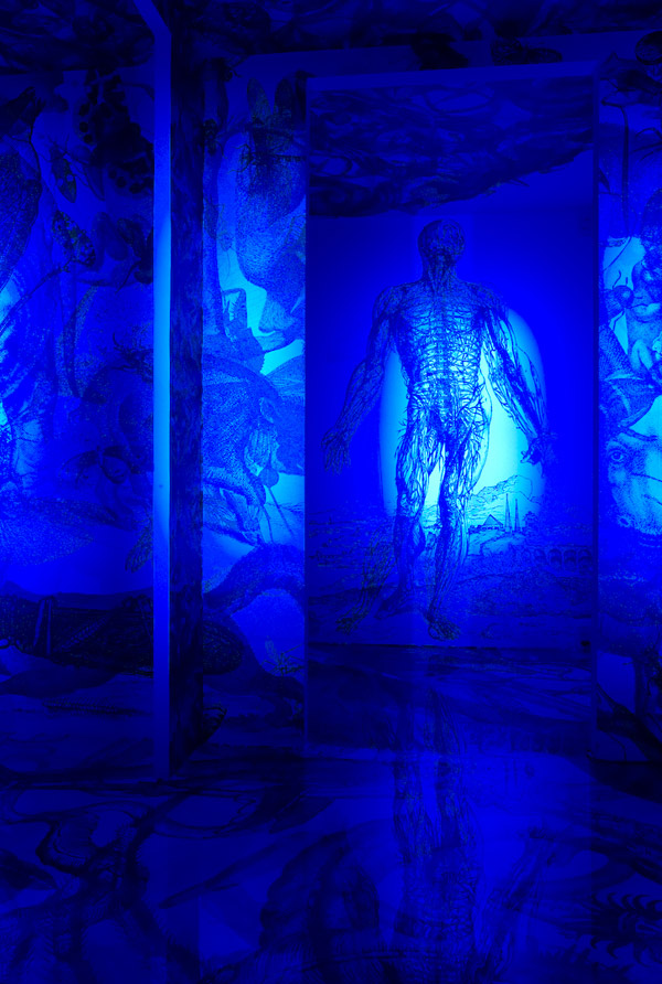
Those pictures are all of the same room, with a different color light to highlight a certain layer. SO COOL.
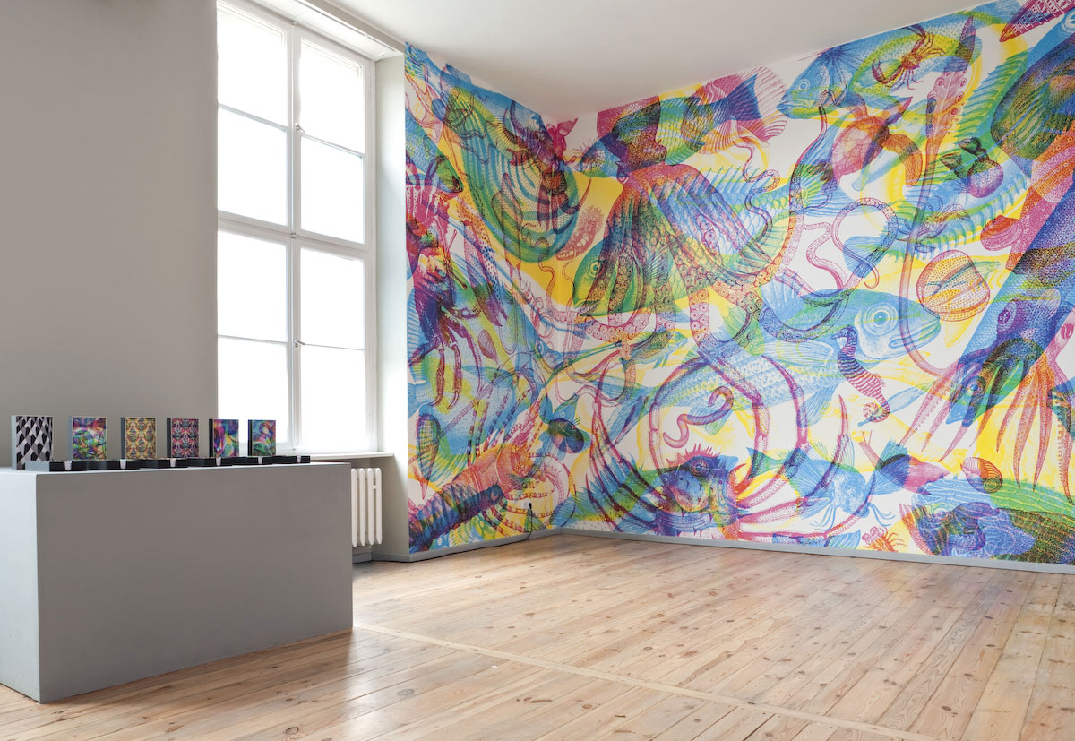
Can I have this on a wall in my house PLEASE?
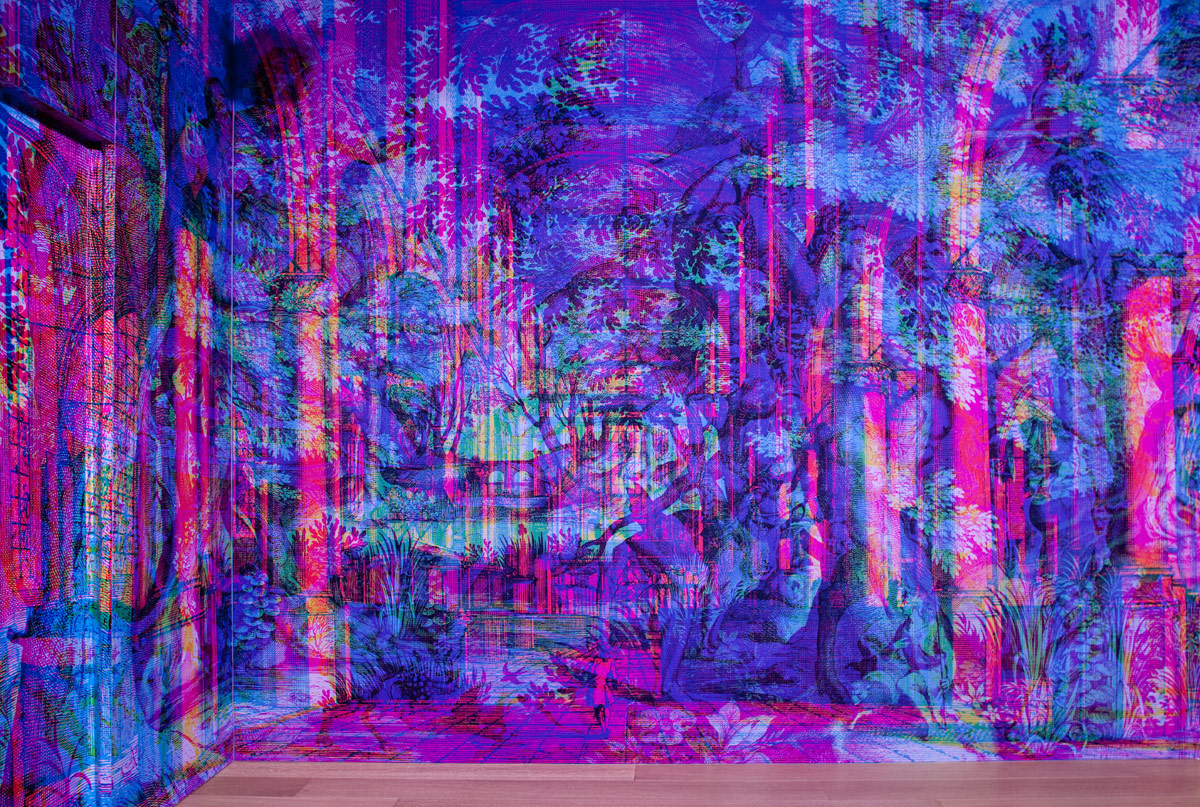
This work of art makes me feel like the blogger at The Jealous Curator because I'm SO JEALOUS of this idea. It's amazing.
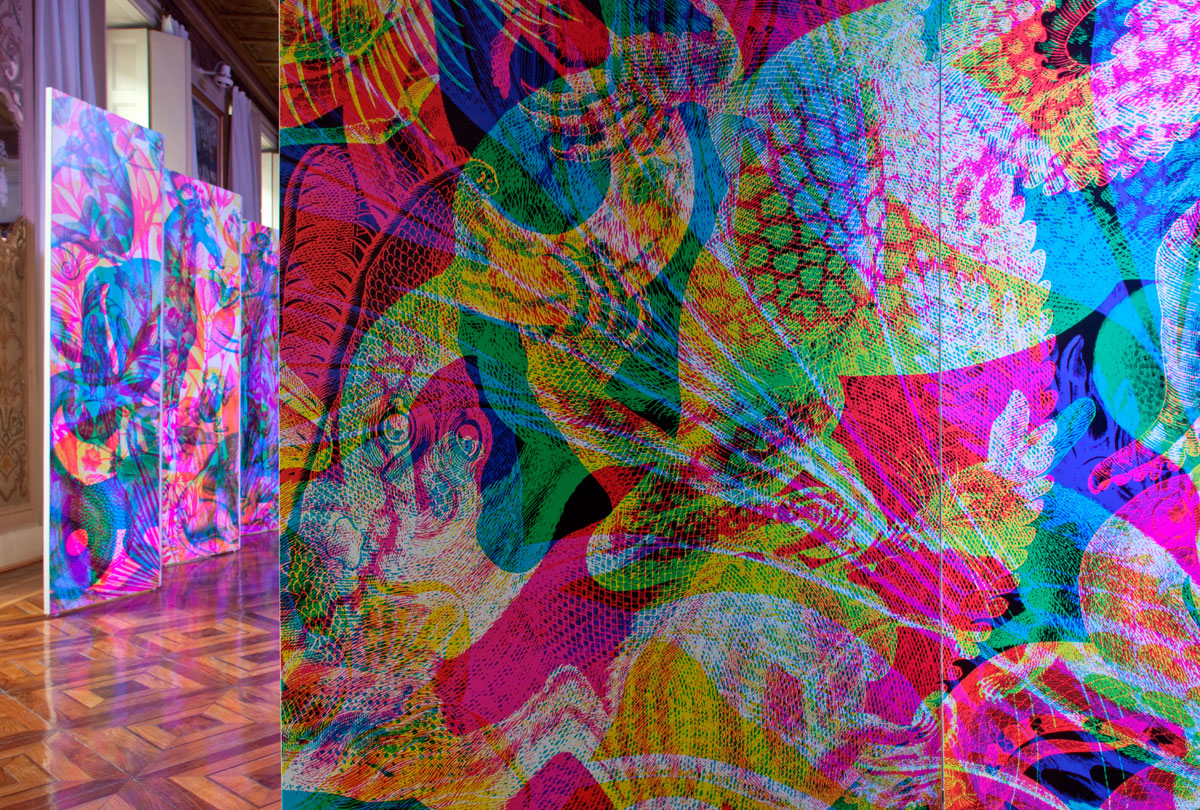
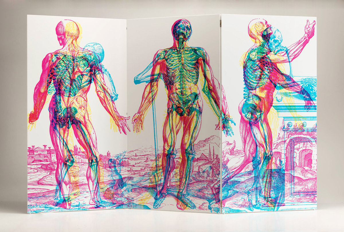
I hope you all enjoyed. and thank you Katie B. for showing me this!
Friday, May 3, 2013
Artist Spotlight - Mr. Bingo - Hate Mail *Bonus! Jill Wignall*

Apparently drunken tweets are good for something. What started as a whim inspired by boredom (The first person who replies to this tweet I will send an offensive post card to.) turned into a new project when the tweet got 50 responses within a minute. What is it, you ask? Mr. Bingo sends you Hate Mail!
More after the jump!
Subscribe to:
Posts (Atom)